
Wave Machine
Problem
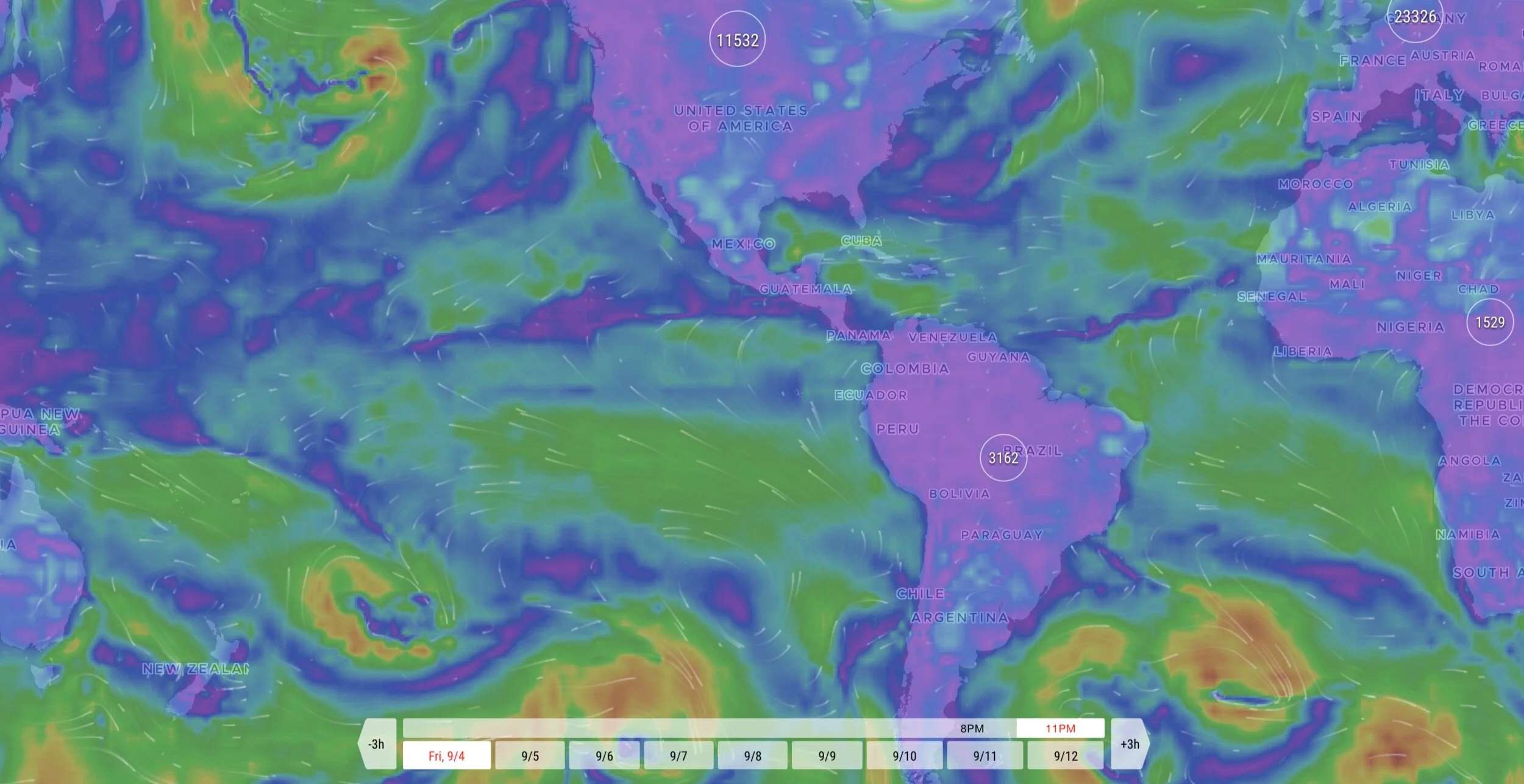
Apps designed for water sports enthusiasts are overly complicated. The interfaces of these apps are typically shown through satellite imagery. Often complex color codes are used to display severe or incoming weather. The result is a confusing application with a steep learning curve. One that users must valuable devote time to in order to understand.
Solution
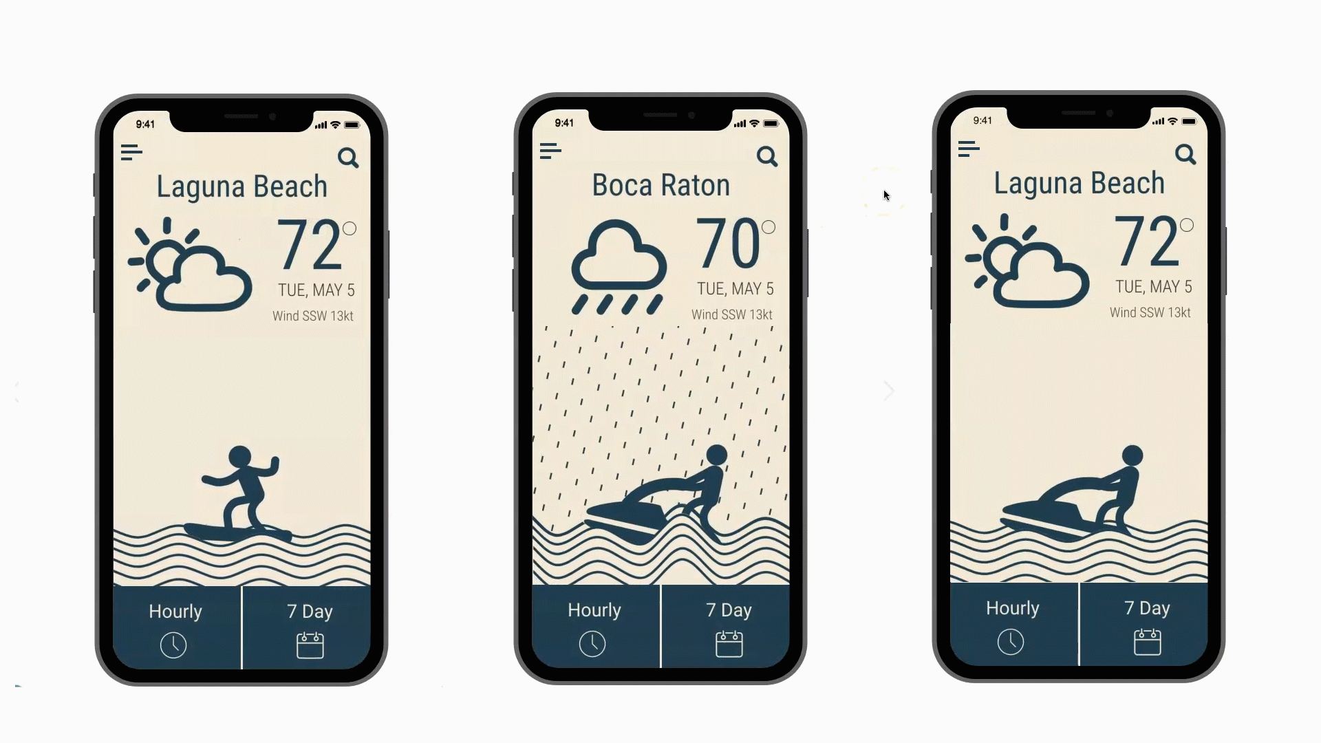
We set out to create an app that displays the information in a fun, visual way. Rather than relying on graphs or color patterns the information is clean and easy to read at a glance. The intention was to make the user’s experience informative, aesthetically pleasing and a pleasure to use.
The Application
Competitive Research
We analyzed three competitive apps to see what was currently available for water sports weather app users.
While accurate, charts and satellite imagery is not easy to understand, and requires users ascend a massive learning curve.

Windguru

Surfline
Windfinder

Personas
Looking at reviews from the other apps. We created personas based on two types of users.
Destiny - A surfer who get’s out to the beach almost every day.
Alan - A user who loves the to get out on the waves but only a few times a month.

Task Flows
The next step is to define the task flows the users will take and flesh out those screens.


Information Architecture
IA is an almost invisible part of the design process. Yet it’s important to define how the information is organized and presented to ensure a smooth user experiance.

Wireframes
For me, the actual design process always begins with a sketch. From there it’s a gradual process of making the prototype more polished.
With each iteration we get closer to that final draft. Here is a selection of some screens and how they’ve evolved.

Low FidelityPrototype

Mid Fidelity Prototype

High Fidelity Prototype
Animations
Creating the animations for this app was very difficult. We had to try and test multiple prototyping tools before finally settling on XD and Proto.io.
Despite the initial difficulty the final result was a creation unique and rewarding.
Style Guide
After finishing a project, we always create a style guide.
This guide assures further iterations will remain true to the design’s original heuristics.


View Prototype
Curious? Feel free to click on the button below to test drive the finished prototype.

Thanks for stopping by.